Cryptic Retooling the Star Trek Online Character Creation Process
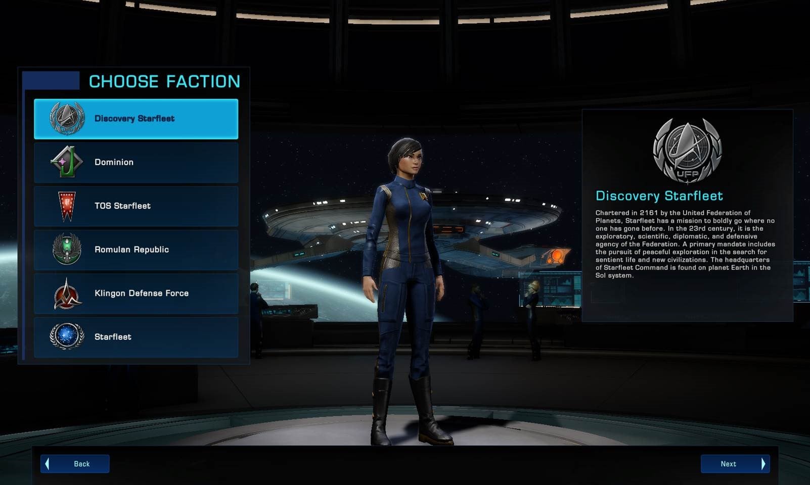
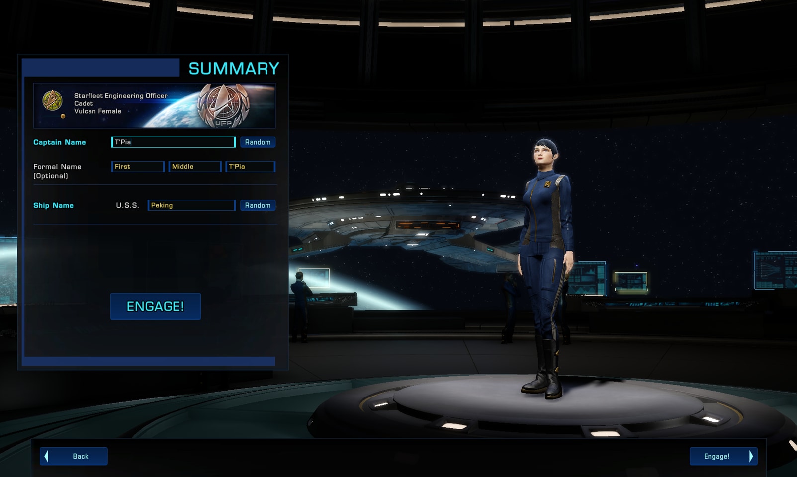
A new blog post has arrived on the Star Trek Online site to give players a heads up about some big changes coming to character creation. UI Designer Jo Gianulis writes that, at the start, STO character creation was simple and worked well but that, over time, it became "bloated and overwhelming" due to the addition of new species and factions. The process began to "clean up the UI and cut down on the visual clutter".
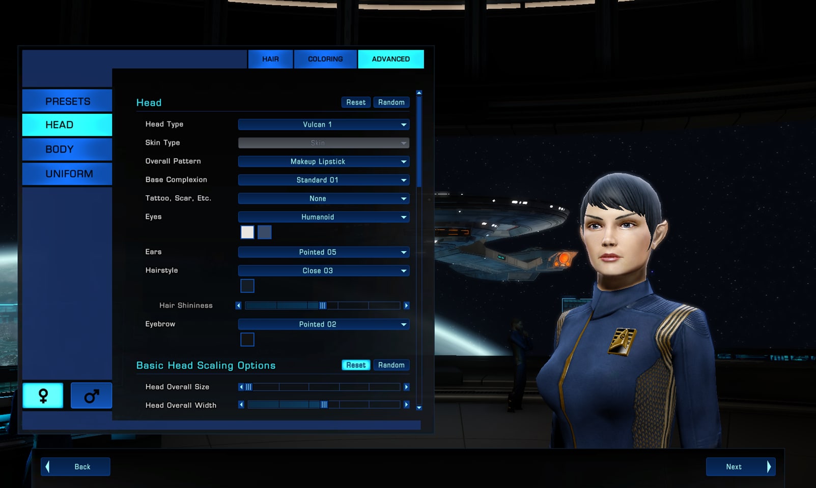
With the revamped UI, my goal was to keep as much of the spirit of the original UI alive while also making it really clear and easy to select your options and get into game fast. Almost all of the old options are still there if you want them, but it doesn’t feel like you have to solve a puzzle just to get into game. That said, there are a few features you won’t find in the new Character Creator, such as the Save Outfit and Load Outfit features. These still exist in the Tailor UI, which hasn't changed at all, once you get in game.
In addition to the above, a number of QoL improvements are being added, "such as letting you change your gender on the appearance page or giving you a default ship name" that can be changed later in the game.
There are more changes coming for Character Creation and to other UI systems in the game.
Check out the full post on the Star Trek Online site.
Hey there - my name is Jo, and I'm the UI designer on STO! To say I am passionate about this update is a bit of an understatement. My first goal upon joining the team was to address the Character Creator UI, and when they said I could work on it I literally jumped up and danced. I am ecstatic that my first post gets to be about something I care (maybe too much) about: Player Experience and Space Barbie. Okay, that was two things I care greatly about...
The character creator is one of those features you see in games that started out simple, and worked fine when it was made, but as new factions and species were added to the game, it quickly got bloated and overwhelming. My first goal was to clean up the UI and cut down on the visual clutter. We used to just throw every option at you all at once on one page. When I built my first character I was so excited to see all the options, and the LCARS were so immersive, but I was so overwhelmed that I had to walk away and come back to it later. We wanted to take away that overwhelming feeling, while still giving you access to all the options you wanted.
With the revamped UI, my goal was to keep as much of the spirit of the original UI alive while also making it really clear and easy to select your options and get into game fast. Almost all of the old options are still there if you want them, but it doesn’t feel like you have to solve a puzzle just to get into game. That said, there are a few features you won’t find in the new Character Creator, such as the Save Outfit and Load Outfit features. These still exist in the Tailor UI, which hasn't changed at all, once you get in game.
We also snuck in a lot of tiny “Quality of life” fixes, such as letting you change your gender on the appearance page, or giving you a default ship name (don’t worry, if you forget to name your ship something truly unique, you can always change it later in game!)
There are several other features that I am still exploring for the new Character Creator, and I am hoping this will just be the first of many polish passes for older UI systems in the game. They say a good UI is one that no one comments on, but I’m hoping you will all take a few minutes to go make a new character, check out the new UI, and let us know what you think. And by the way, everyone is getting a free character slot, so you can try the new creator out if you want.
